In Honor's Defense by Karen Witemeyer Book Blog Tour


Guest Post
By Karen Witemeyer
The final installment in the
Hanger's Horsemen trilogy has arrived! As an artist who paints pictures with
words, I never fail to be in awe of the artists who take my words and use them
to paint an actual picture.
Covers are so important to a book.
It's the first impression the story makes on the reader. It needs to convey
genre, time period, and hint at the plot all while grabbing the reader's
attention with something fresh and intriguing. Such a challenge!
Authors working with a traditional
publisher have much less say in the cover design process than authors who indie
publish. The publisher's marketing, sales, and editorial teams work together
with the design team to craft a compelling cover. I'm more than grateful to
have the help.
At the beginning of the process, my
project manager asks me for story details, physical descriptions of the
characters and setting, and any ideas I have for cover design. Yet that is
where my input ends until the very last stages of the design process. Here is
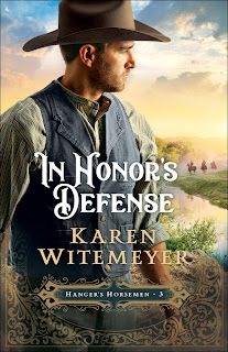
the final product we arrived at for Luke Davenport's story.
The last change I asked for was in
the color of his vest and hat. In the current version, the brown vest and light
tan hat are nearly identical to the ones worn by the model for the first book
in the series. I wanted the men to feel distinct and carry their own
personalities. So in the final version, you will see that the vest is blue and
the hat is a darker shade of brown. Just the type of change I was looking for!
They also added a bit more vegetation in the foreground for an extra pop of
color. I'm so pleased with the final product!
Can you tell that I took inspiration
for my hero from a pair of football players? I modeled Luke's physical
appearance on a cross between Howie Long and JJ Watt—one from my generation and
one who is actively playing. I think the model they found pairs well with the
image I was envisioning.
Now that the series is complete, I
thought you would enjoy seeing all the covers side by side.
They look good together, don't you think?
Which cover is your favorite of the series?


(US only; ends midnight, CDT, 7/8/2022)
|
6/28/22 |
Notable Quotables |
|
|
6/28/22 |
BONUS Promo |
|
|
6/28/22 |
Review |
|
|
6/29/22 |
Guest Post |
|
|
6/29/22 |
Review |
|
|
6/29/22 |
BONUS Promo |
|
|
6/30/22 |
Author Interview |
|
|
7/1/22 |
Scrapbook Page |
|
|
7/1/22 |
Review |
|
|
7/2/22 |
Excerpt |
|
|
7/3/22 |
Excerpt |
|
|
7/4/22 |
Review |
|
|
7/5/22 |
Series Spotlight |
|
|
7/6/22 |
Review |
|
|
7/6/22 |
Excerpt |
|
|
7/7/22 |
Review |
|
|
7/7/22 |
Review |


.png)


Comments
Post a Comment